ABOUT THE CASE
This project traces and visualises discursive shifts in the monthly frequencies of symbolic mentions and discursive strategies over the span of nearly three years on the Fortress Kyiv Telegram channel. Katarina analyses how Telegram users engage with war-related symbols as dynamic semiotic resources whose meanings are continuously negotiated. The chart demonstrates this approach on a selection of Telegram posts. In doing so, it introduces another level of contestation, through a juxtaposition of Katarina's interpretation and possible counter-perspectives.
This project examines symbolic contestation in the context of Russia’s full-scale invasion of Ukraine through the analysis of a single, prominent pro-Ukraine Telegram channel (Fortress Kyiv). Since February 2022, Telegram has become a key platform for wartime communication, where symbols circulate rapidly and acquire heightened political and affective significance. In this environment, war-related symbols such as Russia’s “Z” and “V” emblems and the Ukrainian slogan Slava Ukraini operate as condensed carriers of meaning, enabling users to articulate resistance, belonging, and moral positioning.
The initial phase of the project focuses on how this Telegram channel engages in the contestation of such symbols over time. Rather than treating symbols as fixed or stable signifiers, the analysis approaches them as dynamic semiotic resources whose meanings are continuously negotiated. Attention is paid to both explicit forms of contestation – such as direct mockery, rejection, or inversion of Russian war symbols – and more subtle strategies, including irony, repetition, intertextual references, and affective framing. By following the channel longitudinally, the project aims to capture short-term reactions to specific events as well as longer-term shifts in symbolic emphasis and narrative construction.
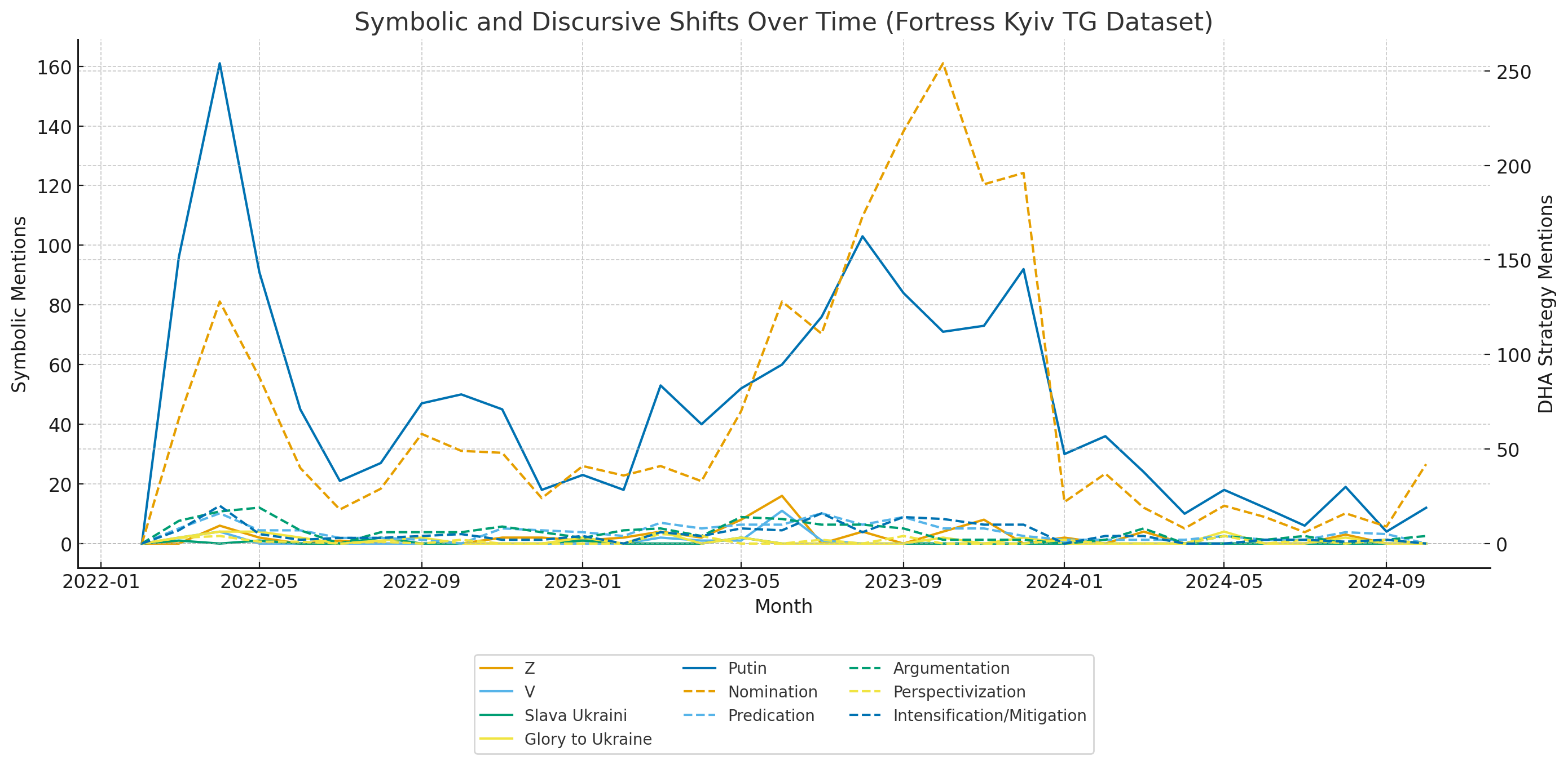
The visualization displays monthly frequencies of symbolic mentions and discursive strategies over the span of nearly three years on the Fortress Kyiv Telegram channel. The left Y-axis tracks how often key symbols such as "Z," "V," "Putin," "Slava Ukraini"/"Glory to Ukraine" are mentioned, while the right Y-axis measures the application of Wodak’s DHA strategies (nomination, predication, argumentation, perspectivization, and intensification/mitigation). The spike in early 2022 indicates an immediate symbolic and rhetorical response to the invasion, followed by moments of intensified or diversified contestation as the war and its narratives evolve.
Methods
The project combines qualitative discourse analysis with exploratory computational tools. The primary analytical framework is the Discourse-Historical Approach (DHA), which enables the identification of contestation strategies while situating them within broader historical and political contexts. To support the initial mapping of the dataset, Communalytic was used to extract frequently occurring words, hashtags, and emojis, as well as to visualize temporal patterns. This tool was particularly suitable for identifying dominant themes, symbolic clusters, and moments of intensification, which then guided closer qualitative analysis.
Positionality
My approach to this material is shaped by long-term experience working with sensitive topics such as hate speech, contested symbols, nationalist discourse, and politically charged memory conflicts in both online and offline contexts. This background has informed a research practice that prioritizes contextual sensitivity, careful interpretation, and reflexivity, particularly when engaging with emotionally charged or polarizing material. Rather than approaching the Telegram data as neutral or detached content, I read it as situated communication produced under conditions of war, trauma, and existential threat. This perspective affects how symbolic expressions, repetition, and affective intensification are interpreted – not simply as rhetorical devices, but as meaningful responses within a high-stakes communicative environment.
Project expansion
As the research developed, the scope expanded to include additional Telegram channels, TikTok, and a broader symbolic repertoire (including cultural figures, monuments, and memory-related symbols). This expansion, however, is part of a separate, ongoing project and is not included in the visualization work discussed here, which focuses exclusively on the initial single-channel Telegram dataset.
ABOUT THE AUTHOR
Katarina Damčević is a researcher at IOS Regensburg whose work focuses on the semiotics of hate speech, contested symbols, and memory politics in post-conflict societies, with a particular emphasis on Southeast Europe. Her current research explores practices of symbolic contestation, interpretive authority, and semiotic governance. She is also an associate at the University of Tartu and the University of Rijeka, a member of the editorial team of Southeastern Europe (Brill), and a co-founder of the Center for Holocaust and Genocide Research in Southeast Europe at the University of Rijeka.
Roles
Author: Katarina Damčević
Visualisations: Iaroslav Boretskii and Mela Žuljević
Advisor: Jana Moser
Katarina: We started from a Communalytic visualization that I produced, which tracked symbolic and discursive shifts over time in the Fortress Kyiv dataset. While this provided a strong quantitative foundation, the analysis relied equally on qualitative coding and interpretation, particularly through the Discourse-Historical Approach (DHA). One limitation of the method is that keyword-based tracking (e.g., “Z”, “V”) captures only explicit symbolic references, whereas much of the later discourse operates through indirect or metaphorical language. This limitation directly informed the shift toward analysing discursive strategies, which better capture the evolving nature of contestation beyond surface-level symbol use.
The Communalytic visualization was analytically useful but visually dense. In adapting it, an important question was how to balance temporal accuracy with narrative readability. The final version retains a conventional horizontal timeline, as this aligns with intuitive understandings of time progression, while incorporating selected posts as interpretive anchors. Rather than visualizing all posts, we opted for strategically selected examples, which function as entry points into broader discursive patterns. As such, the visualization is not meant to be exhaustive, but interpretive and explanatory, guiding the viewer through key shifts in symbolic contestation.
Mela: My first proposal was to make this graphic more user-friendly in a scrollytelling context, so vertically scrollable. This had its limits, as it meant the number of posts would become visualised on the horizontal axis, while time is visualised vertically, which is contra-intuitive. But it allowed us a different view of intensity and how it unfolds in the scrolling.
- Including multiple perspectives in the posts/comments
Mela: In addition, it was important to think about different perspectives of analysing the material in the TG channels and how this can be visualised. E.g., while Katarina’s interpretation is central to the visualisation, we still wanted to include other possible perspectives or critical questions that may not yet be answered. I proposed visualising a chat or comment box under each post for including a discussion between Katarina and other voices in this project: her reviewers, supervisors, colleagues, informants; anyone who might see the semantic values of these posts differently. I thought it was important to show the complexities and uncertainties in the analysis, and how others might challenge the proposed findings.
Iaroslav: First of all, I really liked the initial idea and draft by Mela.
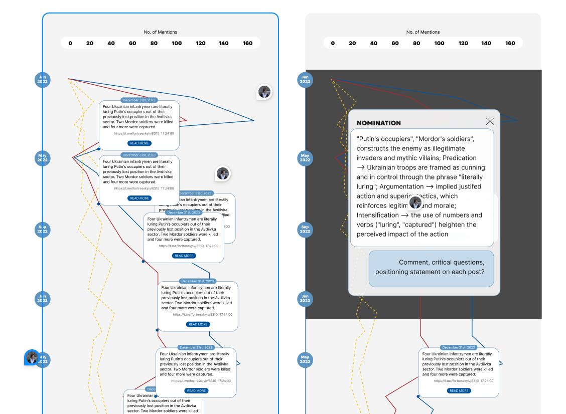
The structure and format of the data provided by Katarina were quite straightforward and easy to understand. We were dealing with the distribution of mentions over time, and the idea emerged to combine individual and broader contexts through an interactive chart and an annotation module. The main inspiration came from the Highcharts annotated line graph (https://www.highcharts.com/demo/highcharts/annotations).
I used their library because I find its capabilities, as well as its wider range of visualization products, particularly interesting. I wanted to personally experiment with a declarative JSON-based format for data visualization that could be edited through code.
At the very beginning, I had only a limited idea of how this could be done, but with the help of AI I was able to develop an initial code structure, which I then manually and gradually expanded and refined. One of the main challenges of this visualization concerned the editing of the annotations themselves.
Since they had to exist as HTML text, it was quite difficult to parse different paragraphs and tags in a way that would still look interactive and appropriate. It was quite likely necessary to create an additional mini-database or CSV containing the full content itself, along with the selected words and annotations. However, since there were only ten such Telegram posts selected in total, I decided that it would be better to retain full control over each paragraph inline.
For the graph itself we can indeed see the number of mentions, as well as the specific content of the posts, with highlighted discursive shifts and the author’s own reflections on particular linguistic methods.
Katarina: The “chat box” feature was implemented as a layered annotation element within the Highcharts interface, where selected posts are accompanied by a second interpretive layer. Due to technical constraints, this was simplified into short, contrasting commentary rather than a fully interactive dialogue thread. This allowed us to introduce epistemic plurality into the visualization in order to show the dynamic nature of interpretation. This feature is particularly important given the nature of the dataset: Telegram posts often rely on implicit meanings, irony, and culturally embedded references. By including alternative readings (e.g., critical or questioning perspectives), the visualization reflects not only the data, but also the process of interpretation itself, including its uncertainties and limits.
- Use of colours for the different keyword/lines
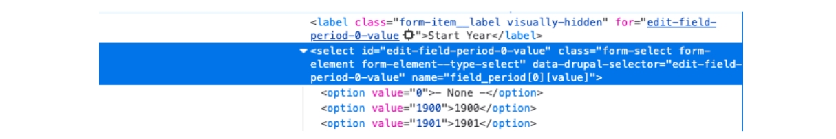
Iaroslav: Frankly speaking, the choice of colours could still be considered questionable, although the blue and black were selected for rather better contrast inbetween. For pro-Russian symbols, I deliberately wanted to avoid using red or any other red shades strongly associated with Russia. In that respect, it seemed more appropriate to use a somewhat hue-0 colour, which in this case led me to black and shades of grey.
At the same time, Ukraine still needed to be marked out in a clearly contrasting way. This is probably not the first time I have noticed how colours become associated with particular countries through their national flags or symbols, especially. Blue, and perhaps yellow as well, may partly evoke Ukraine for me, but in this case blue also seemed, across the wider spectrum, sufficiently contrasting. The selected blue tone feels closer to a technological shade of blue that you’d rather see as a default tone nowadays in e.g. Inspector browser window:
So the current colours function as a way of showing contrast between the two groups of symbols.
Katarina: The choice of colours in the chart reflects both analytical clarity and semantic associations. War-related symbolic markers (e.g., “Z”, “V”, “Putin”) are represented through more visually prominent or contrasting tones, allowing their peaks – especially in early 2022 – to stand out clearly. In contrast, discursive strategies (e.g., nomination, argumentation) are visualised using more subdued or dashed lines, signalling their role as analytical layers. Colour differentiation was necessary to avoid visual overload, given the number of overlapping lines. Accordingly, the palette balances readability, distinction, and thematic coherence, while still allowing users to track shifts over time without privileging one interpretive layer too strongly over another.
3. On positionality
Katarina: This project also reflects my own positionality as a researcher working with politically sensitive, ongoing conflict data. Telegram is characterised by high levels of affect, immediacy, and in-group communication, which shapes both the production and interpretation of content. My analysis is therefore necessarily interpretive, informed by linguistic, cultural, and contextual knowledge, but also open to revision. The inclusion of alternative perspectives in the visualization is partly an attempt to make this interpretive process visible, rather than presenting the analysis as fixed or authoritative.